
The Risk Profile provides a high-level overview of risk & reward tradeoffs for individual security, portfolio, model, household, or any group of investments. It is broken down into 11 widgets including Holdings, Stress Test Risk + Return, Performance History, Correlation Risk, Risk Measures, Fee Analysis, Sector Analysis, Style Analysis, Drawdown Analysis, Geographic Analysis, and Fixed Income Analysis.
To access the Risk Profile, find your portfolio in the search bar at the top-left of your screen. You can also go to the top-right and click on <Reports → Risk Profile> and then input your portfolio or symbols. In this example, we will look at Harry Potter’s portfolio and assess his Risk Profile. Please note that the (+) sign in top-right hand corner on any widget will open additional details.
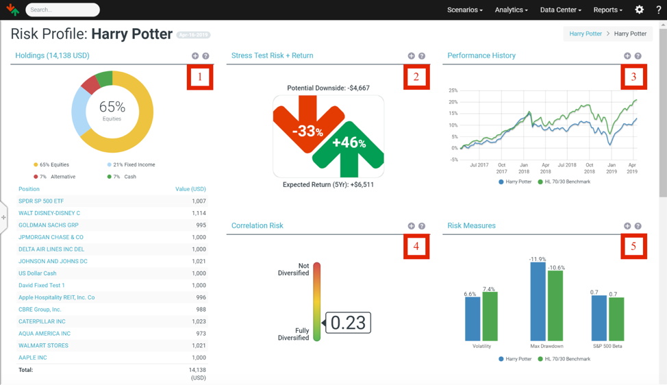
1. Holdings
The asset allocation for the portfolio is broken down into four major categories (Equity, Fixed Income, Alternative, and Cash), and a full listing of current positions is provided. The (+) sign shows the specific characteristics of each holding.
2. Stress Test Risk + Return
The Stress Test Risk + Return widget compares the portfolio’s potential downside risk (red arrow) against the 5-year expected return of the portfolio (green arrow). Specifically, the number in the red arrow indicates the greatest potential loss across all of Orion Risk Intelligence scenario outcomes. We see that Harry Potter should expect a -33% potential downside risk and a +46% 5-year expected return from his portfolio.
Red Arrow = Downside Risk: This is the maximum downside calculated across all of the scenarios selected. You can customize the scenario list by clicking on the diagram, and then clicking <Customize> at top-right.
Green Arrow = 5-year Expected Return: The system first calculates the expected return for the portfolio by pooling the one-year weighted average expected return across all selected scenarios. The one-year expected return is then compounded to obtain a 5-year estimate. Historically, major downside events occur roughly twice a decade, so this is an appropriate timeframe for comparison of long-term returns and downside scenarios risk.
The (+) sign gives a full listing of the potential upside and downside impact for all scenarios. To learn more about a topic and the specific outcomes, click the name of a scenario.
3. Performance History
The chart shows the performance of the portfolio compared to a benchmark. In this example, we compare the Harry Potter’s portfolio with HiddenLevers 70/30 (70% SPY and 30% AGG) Benchmarks. Please refer to HiddenLevers Benchmarks to learn more about how Orion Risk Intelligence constructed these benchmarks. To customize benchmarks, click on <edit the portfolio.>
Please note that this chart does not take into account trading history as the system does not store the actual trading history for an account; the chart reflects the performance of a static portfolio allocation. For model allocations, the chart reflects performance assuming that the portfolio is rebalanced to maintain the allocation over time.
A note on frequency of data points for performance history: Individual stocks, ETFs, Mutual Funds will use daily data for performance history and other statistics based on past performance. Some other assets such as SMAs and Custom Assets with monthly data points will use those. Portfolios, including all percent-based portfolios, use weekly data points by default to calculate performance history and statistics. Dollar and share based portfolios with only one holding will use daily data points. If a portfolio contains any positions with monthly data points, the system will use monthly data for the entire portfolio.
Click the (+) sign to see a larger version of the chart.
4. Correlation Risk
The number on the spectrum is a measure of both correlation and concentration risk, computed based on the portfolio's full correlation matrix. Correlation risk refers to the risk of loss arising from the change of historical relationships between two securities in a portfolio; concentration risk refers to the risk of loss stemming from heavily lopsided exposure to a particular security/sector.
The metric ranges between 0 and 1, with 0 representing an infinite number of perfectly uncorrelated positions, and 1 representing any number of perfectly correlated positions. A single position portfolio also receives a score of 1 (based on extreme concentration risk). We see that Harry Potter has a low correlation risk of 0.23, indicating a fairly well-diversified portfolio.
5. Risk Measures
This section provides a comparison between the portfolio and its benchmark across several key risk metrics (Volatility, Max Drawdown, and S&P 500 Beta). The additional details screen gives a larger range of comparison metrics, and which economic levers impact the portfolio the most.
The traditional measures will compare your portfolio against a designated benchmark. The benchmark is automatically selected based on asset allocation. To customize benchmarks, click <edit the portfolio.>
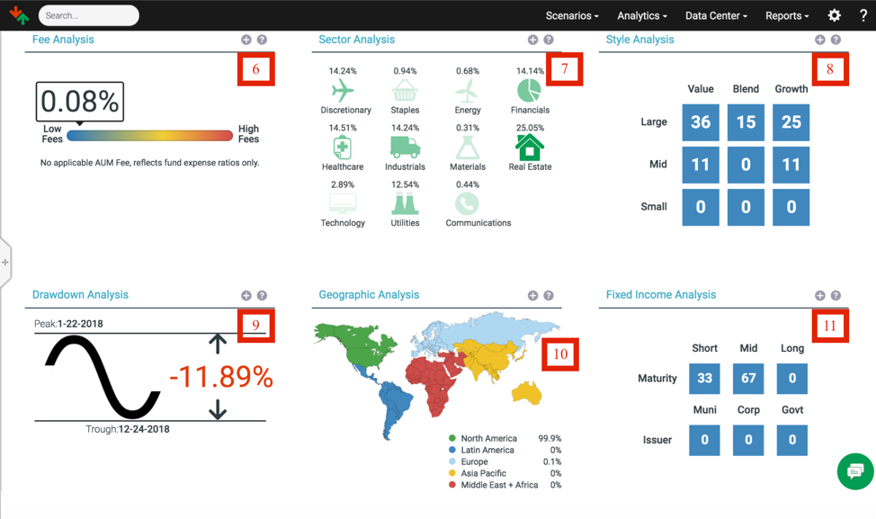
6. Fee Analysis
This widget compares the fee structure of your portfolio and a benchmark. The rainbow spectrum spans between low fees and high fees. Generally, equity investments possess little to no fees while mutual funds and ETFs investors have to indirectly pay the fees in the form of operating expenses. Please note that the spectrum reflects fund expense ratios only and does not apply to Assets under Management (AUM) fee.
Click the (+) sign to see detailed fee information of your portfolio.
7. Sector Analysis
This widget provides a comparison between the portfolio and its benchmark across several key sectors. The sectors category includes Discretionary, Staples, Energy, Financials, Healthcare, Industrials, Materials, Real Estate, Technology, Utilities, and Communications. We see that Harry Potter’s portfolio invests different percentages in all of the sectors!
Click the (+) sign to see a larger range of comparison metrics, and also to see which economic levers impact the portfolio most.
8. Style Analysis
Style Analysis digs into the investment style of the equity portion of both the portfolio and a benchmark. The table shows the aggregated result of your portfolio’s investment style (value, blend, and growth) and size of your investment companies (large, mid, and small). For example, 36% of Harry Potter’s equity sleeve is of large value.
Click the (+) sign to get a deeper look at the style comparison.
9. Drawdown Analysis
This widget shows the biggest peak and trough of the equity performance over the selected period. The drawdown is quoted as the percentage between the peak and the subsequent trough. In the Harry Potter’s example, we selected a time frame of 2 years, and we see the peak on 1/22/2018 and the subsequent trough on 12/24/2018 with a percentage change of -11.89%.
Click the (+) sign to see a more detailed movement and how it compares to a benchmark.
10. Geographic Analysis
Geographic Analysis provides a map-representation of how your equity portion spreads out by geographic locations and development types (Domestic, Emerging Markets, or Developed International).
Click the (+) sign to see a more detailed map and how it compares to a benchmark.
11. Fixed Income Analysis
This widget analyzes the fixed income portion of your portfolio and how it compares to a benchmark. The table breaks down the maturity (short, mid, or long) and the issuer (municipality, corporations, or the sovereign government) of your fixed income portion. For example, 33% of Harry Potter’s fixed income sleeve has a short maturity date.
Click (+) sign to access the yield, duration, type, and credit quality of your fixed income portion